Vanta Labs
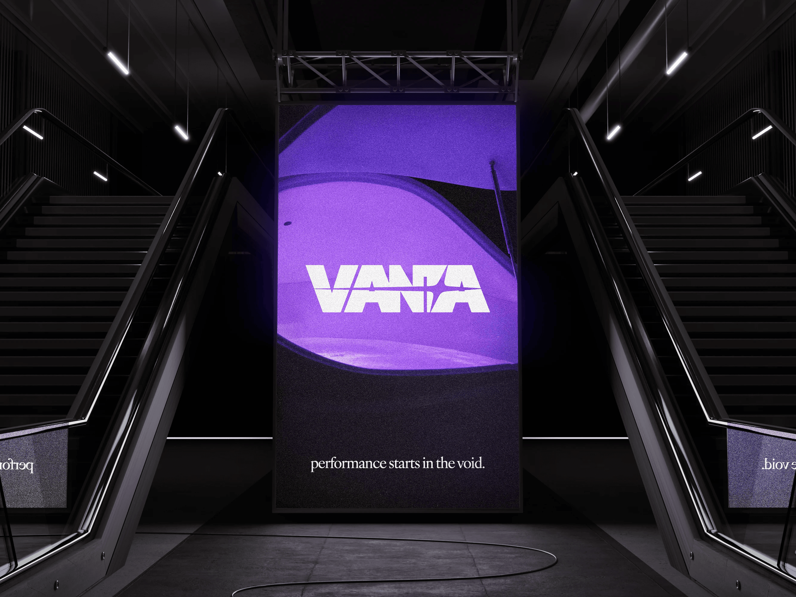
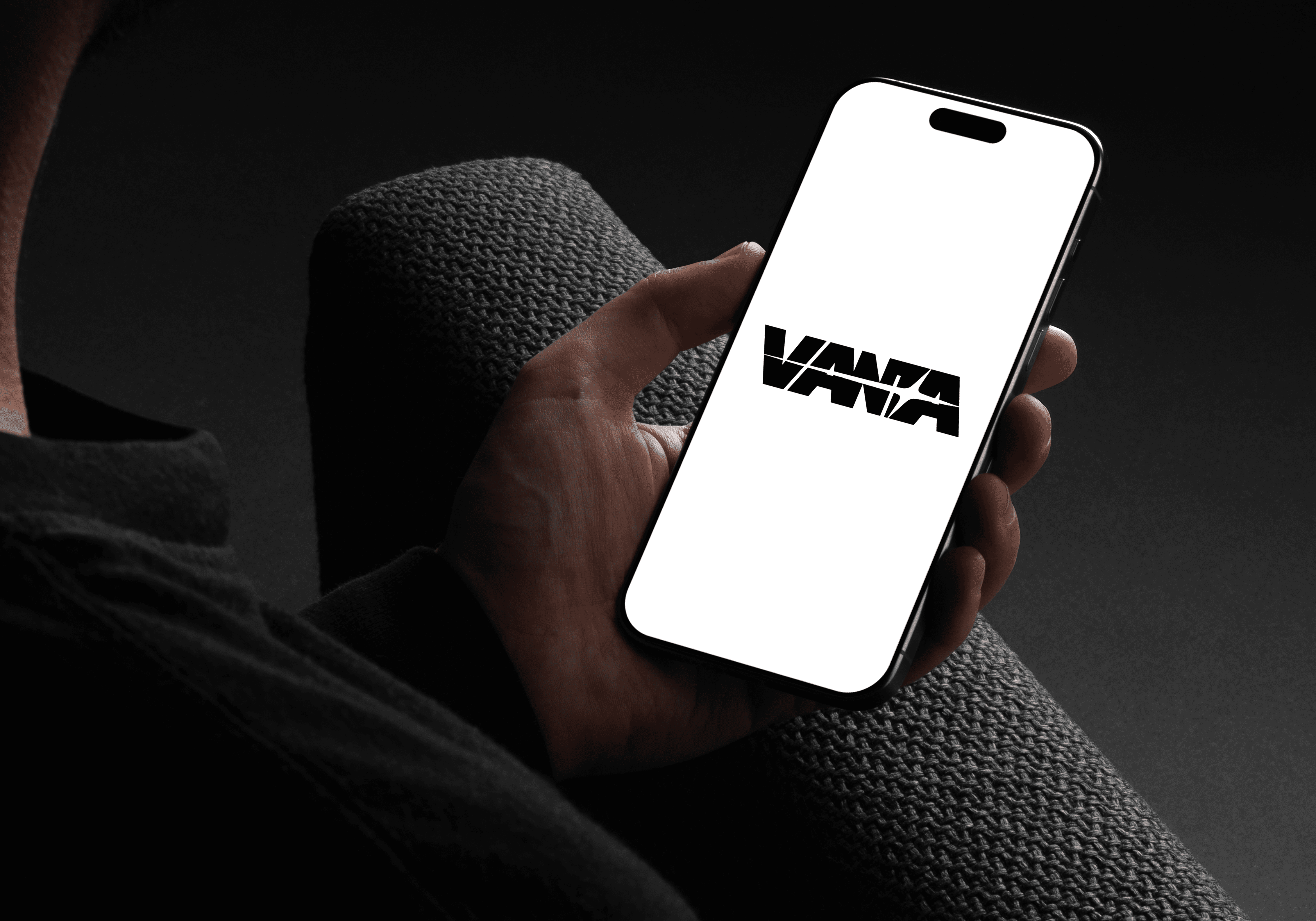
Brand-new brand identity for Vanta, a dark but innovative sports recovery company.
//
Category
Full package
//
Stack
Adobe Illustrator and Framer
//
Timeline
2 Weeks
// Project Goals
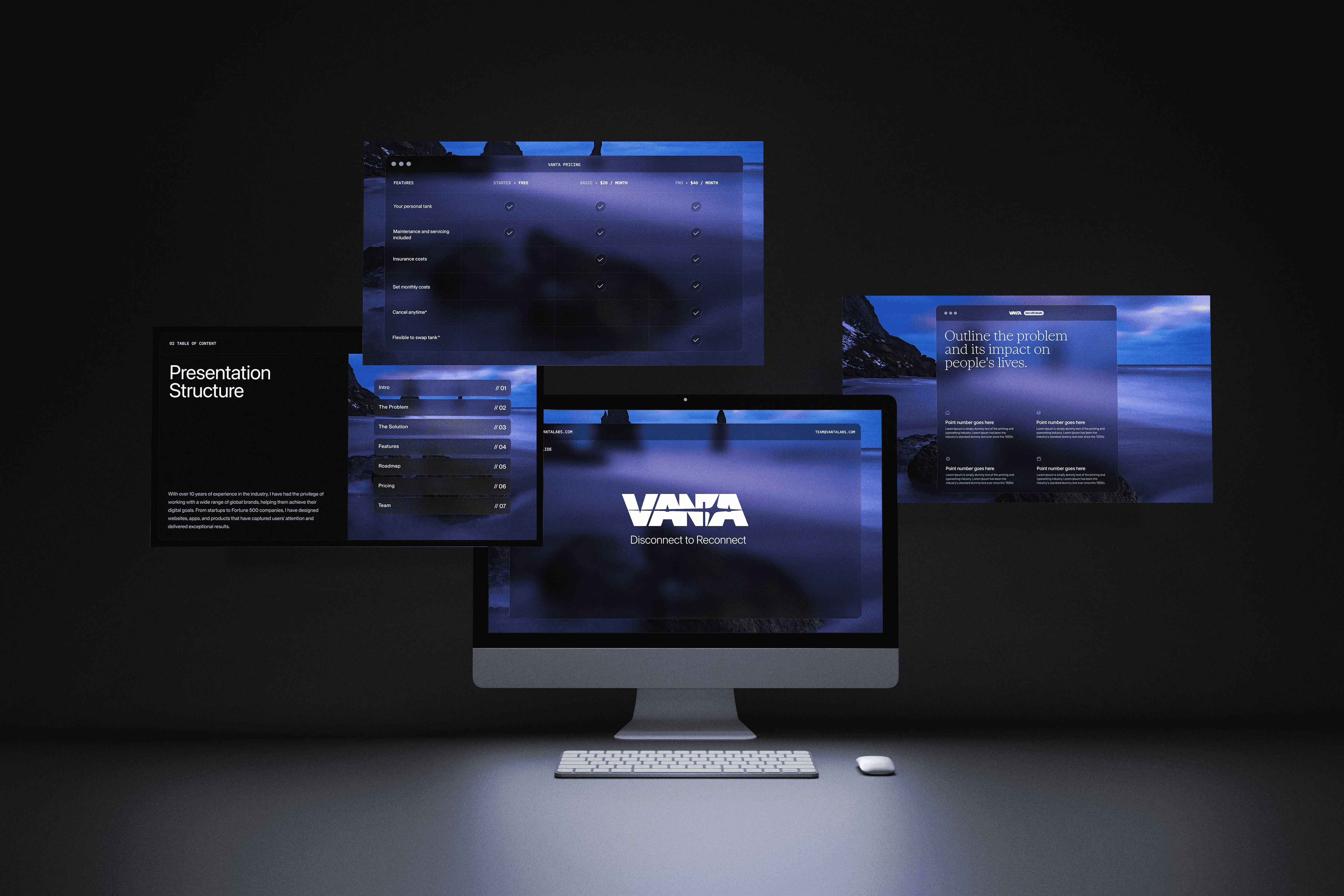
Vanta came in with a strong concept and nothing else. A sports recovery brand built around sensory deprivation tanks needed an identity that could make the science feel desirable, not clinical. The goal was to build a full brand system from scratch: logo, color language, typography, and visual direction that communicated elite recovery without leaning on the tired tropes of the sports supplement world.
// The Result
We delivered a complete brand identity anchored in darkness, literally. The visual system leans into deep blacks and muted tones that mirror the sensory deprivation experience itself, giving Vanta a look that feels more like a luxury wellness company than a locker room product. The brand now has the foundation to scale into packaging, digital, and retail without losing its edge.